

If you've ever held an iPhone 14 Pro Max in your hand, you know it's more than just a smartphone-it's a piece of polished hardware that feels intentional at every angle. As a Longze Crossborder specializing in premium display components, I've spent years breaking down how the screen isn't just a tool for seeing content, but the core of the phone's entire visual identity. Too often, people overlook that the screen is the first thing you unlock, the last thing you see before bed, and the single element that ties the phone's exterior, software, and user experience together. The 14 Pro Max's display isn't an afterthought; it's the canvas that makes the entire device feel cohesive, luxurious, and built for how we actually use our phones every day.
Let's start with the basics that people notice immediately, even before they dive into specs. The 14 Pro Max's screen uses a super-slim design that erases the line between the display and the phone's frame. Before this, many smartphone screens had a noticeable "lip" where the glass ended and the metal frame began-you could run your finger along the edge and feel a subtle ridge. Apple engineered the 14 Pro Max's screen to sit almost flush with the frame, a feat that required precision engineering to align every pixel layer, glass panel, and bonding agent perfectly. As a supplier of the 14 Pro Max Screen, I've worked on refining this alignment process to ensure every unit leaves our facility with zero visible gaps, a detail that separates a mass-produced phone from one that feels high-end. Compare that to older models like the iPhone 12, whose display had a slightly more pronounced bezel; while the [Screen for Iphone 12] holds up well, it doesn't have the seamless edge that makes the 14 Pro Max's screen feel like an extension of the body.

The slim profile doesn't just look good-it makes the phone feel more compact in your hand, even with its large 6.7-inch display. That balance of size and smoothness is a big part of why the 14 Pro Max stands out aesthetically.
Next, there's the display's dynamic range, which does more for aesthetics than most users realize. The 14 Pro Max uses an OLED panel that cranks its peak brightness up to 2,000 nits in sunlight-way brighter than the 1,200 nits of the iPhone 13 Pro Max, and a jump that makes a huge difference for how content looks outside. But aesthetics here aren't just about brightness; it's about how the screen renders contrast. Deep blacks, for example, aren't just functional for watching movies-they make the phone's bezels appear smaller, because black pixels blend into the black frame when you're not looking at something bright. On the 14 Pro Max, that contrast is so sharp that when you're on the home screen, the icons pop but the background feels like it's part of the phone's frame, not the screen itself. This is a step up from mid-tier displays, and even from some predecessor models. When our team tested the [New Screen for Iphone 14] before the 14 Pro Max launched, we noticed that its enhanced contrast ratio laid the groundwork for the Pro Max's even bolder performance-small tweaks to panel calibration, like adjusting the way pixels turn off, made the overall device look less clunky and more refined. The dynamic display also works with the always-on feature, which is a game-changer for aesthetic consistency. Instead of the screen turning completely black when the phone is locked, it shows a dim, static view of the time and notifications. This means the front of the phone is never fully dark, so the metal frame and display look like a single, unified piece even when the screen is inactive. It's a small detail, but it eliminates that jarring "light switch" effect older phones had, making the device feel more polished and intentional.
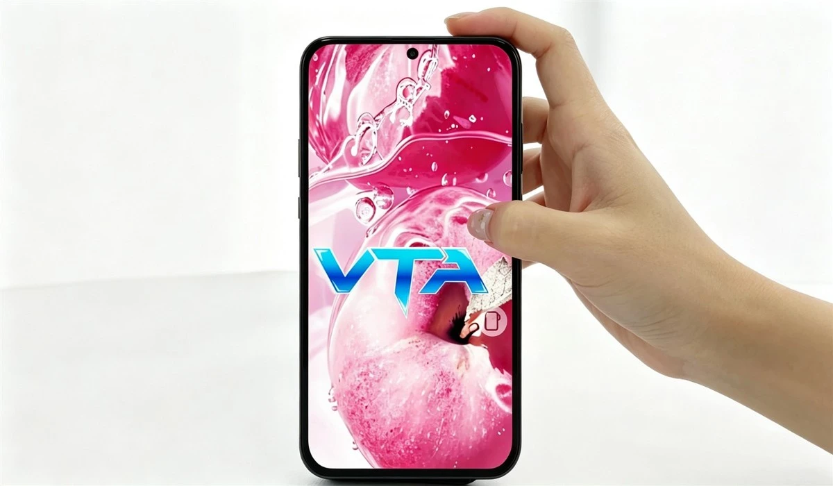
Then there's the shape of the screen itself. The 14 Pro Max uses a sleek, curved design along the edges of the display that wraps slightly onto the phone's side-something you don't see on flat, rigid displays from older models. This curved glass isn't just for looks; it softens the transition between the screen and the aluminum frame, so when you hold the phone, there's no hard edge digging into your hand. For a screen supplier, this requires special handling: the glass has to be bent with extreme precision, and the display's touch sensors have to work seamlessly across the curved area, so swiping from the edge doesn't feel laggy or unresponsive. When we compare the 14 Pro Max's curved screen to the flatter [Display 12 Pro], the difference is clear. The 12 Pro's display looks sharp, but it has a more utilitarian, flat design that emphasizes functionality over flow. The 14 Pro Max's curved edges make the entire device feel like it flows from front to back-run your finger from the top of the screen down the side, and it's a smooth, continuous curve, not a sharp break. That visual flow is a big part of why the 14 Pro Max feels so premium; it doesn't have the blocky, geometric look of older iPhones, and the screen is the reason that continuity exists.
Color accuracy is another underrated part of the screen's aesthetic contribution. Most users don't think about whether their phone's display shows true blues, reds, and greens-until they see a photo that looks washed out or oversaturated. The 14 Pro Max's screen is calibrated to display 100% of the DCI-P3 color gamut, which is the standard for professional photography and video. This means when you take a photo on the 14 Pro Max, it looks exactly how the photographer intended on the screen, not distorted or altered. For the overall phone's aesthetic, this consistency matters because it ties every interaction together. When you open an app, scroll through a photo album, or watch a movie, the colors are uniform, so there's no jarring shift in how content looks from one screen to the next. It's a subtle detail, but it's what makes the phone feel "finished" rather than cobbled together. As a supplier, we test every 14 Pro Max Screen to ensure color accuracy within a tiny margin of error-most of the units we ship have color variations of less than 2 delta E, which is so small that the human eye can barely pick up the difference. That level of precision is why the display feels like an integrated part of the phone's design, not a separate component.

There's also the aspect ratio of the 14 Pro Max's screen, which balances content display with the phone's overall form. At 6.7 inches, it's large enough for streaming media, but the aspect ratio is optimized to match the way we hold the phone-tall enough to see plenty of content without feeling too wide. Unlike some Android phones that have extremely tall, narrow screens that look stretched, the 14 Pro Max's screen has a balanced aspect ratio that works for both photos and videos (most of which are shot in 16:9, which fits perfectly) and web browsing. This balance isn't an accident; Apple worked with display makers to adjust the screen's dimensions, and as a supplier, we help refine that aspect ratio in our production processes to ensure it aligns with the phone's body. When you compare it to the [Screen for Iphone 15 Pro], which has a slightly smaller, lighter display, the 14 Pro Max's screen feels substantial without being bulky-exactly the balance that makes a phone feel luxurious, not oversized.
Beyond physical specs, the screen interacts with software to create a cohesive aesthetic that makes the phone feel more than the sum of its parts. The dynamic island, for example, is a feature that lives in the top of the 14 Pro Max's screen, blending notifications, music controls, and other alerts into a sleek, pill-shaped cutout. This cutout isn't a flaw; the screen's design makes it feel intentional, because the OLED pixels around it turn black when not in use, so the island looks like a natural part of the display rather than a hole. Before dynamic island, many phone cutouts felt like afterthoughts, ruining the screen's seamless look. The 14 Pro Max's screen solves that by using pixel-level control to make the cutout blend in, which is a huge aesthetic win. It's small, but it changes how you see the front of the phone-instead of a big, distracting cutout, you have a subtle, integrated feature that adds function without hurting the look. As a supplier, we worked on the pixel integration for the dynamic island, adjusting how the display renders content around the cutout to ensure it never looks messy or out of place.
What makes this all more meaningful is that the 14 Pro Max's screen doesn't just look good when it's new-it holds up over time. Many premium displays get scratched easily or fade, but the 14 Pro Max's screen uses Ceramic Shield, a glass that's more durable than standard Gorilla Glass. This durability contributes to the phone's long-term aesthetic, because it won't get scuffed after a few months of use, keeping that seamless, smooth look for years. When you invest in a high-end phone, you want it to look good even after you've used it regularly, and the 14 Pro Max's screen delivers that. Unlike cheaper displays that start to look dull or faded within a year, our 14 Pro Max Screens retain their color accuracy and contrast for years, so the phone's aesthetic stays consistent long after the initial excitement wears off.
At the end of the day, a phone's aesthetics are about how it feels, looks, and works together in your hand. The 14 Pro Max's screen isn't just a component-it's the backbone of that aesthetic, tying together the physical design, color accuracy, smooth function, and even the way software interacts with hardware. As a supplier specializing in premium iPhone displays, we know that every detail of that screen matters: the curvature, the alignment, the color calibration, the durability, all add up to make a phone that feels intentional and luxurious. If you're looking to source high-quality displays that match the 14 Pro Max's level of aesthetic and performance, we're here to discuss your procurement needs. Reach out to us to learn more about our 14 Pro Max Screen offerings and how we can support your project needs.
References:
- Apple Inc. (2022). iPhone 14 Pro and iPhone 14 Pro Max Technical Specifications. Retrieved from official Apple product documentation
- Display Supply Chain Consultants. (2022). OLED Panel Market Analysis: Peak Brightness and Contrast Ratio Trends for 2022 Flagship Devices
- Consumer Reports. (2023). Smartphone Display Durability and Long-Term Aesthetic Retention Study
- ISO 15008:2017. Ergonomics of human-system interaction - Accessibility requirements for text, symbols, and controls. International Organization for Standardization